Grandfather Economic Report series
| Home &
Contents | Summary | Feedback
| What's New | Eye-opener
| Must See | E-mail
Federal Government Spending Report
- summary page -
by Michael Hodges
(updated Sept. 2016)
- a chapter of the Grandfather Economic Reports - |
(The Grandfather
Economic Report is a series of reports examining economic conditions facing
families and youth, compared to prior generations. This is the summary page of the chapter
on Federal Government Spending. State & Local Government
Spending is covered in a separate chapter)
FY 2015 Federal Govt. Spending of $4
Trillion Consumed >
28% of the Economy, or $12,239 per man, woman and child,
or 43% of the economy counting regulatory compliance
The Social Spending portion consumed
62% of total spending,
and has increased 17 Times Faster Than The Economy
and - federal employee compensation is
2.3 times higher
than paid in the private sector
 Here are a few sample color graphics Here are a few sample color graphics
from the Full Federal Government Spending Report Today's
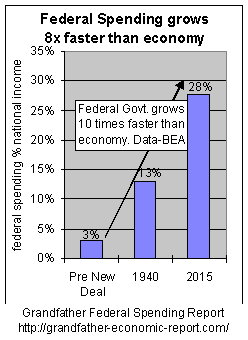
economy is 10 TIMES more federal government-spending-dependent, compared to prior
generations.
The left chart shows total federal spending as a share of the economy - growing from 3%
of the economic pie prior to the New Deal, to 28% of today's economy.
Had total federal spending been reduced following World War II, equivalent to
reductions of the defense spending ratio, the current federal spending ratio would be
about 13% of the economy - - instead of today's 28% ratio - - resulting in 50% less
spending and taxes.
Political leaders chose, instead, to eat up all defense reductions PLUS much more via
massive social spending - - much financed by debt.
Who was it that said we are a nation of small government with a predominant
free-private sector? Well, we used to be - - but, no longer. Does this impact the
future economics and freedom of our younger generation. You bet.
Summarizing: the federal share of the economic
pie increased 800%. |
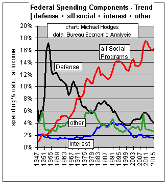 A POWERFUL, REVEALING PICTURE - FEW HAVE SEEN A POWERFUL, REVEALING PICTURE - FEW HAVE SEEN Question:
What has caused the explosive growth of federal spending faster than the economy?
Answer: look for the line in this chart that has risen the most over that
period.
The BIG CULPRIT (rising red line) is SOCIAL SPENDING, which grew 17
times faster than the economy - - to a new high - - more than eating up the
long-term decline of defense spending ratios shown by the black line in the chart. The
full report (link below) shows once the social spending ratio rose above 5% of national
income in the late 1960s, citizen trust in government plummeted to half prior levels - -
and inflation-adjusted median family incomes stagnated for all
families and fell for single wage-earner families. Note social spending (red line) stopped
rising in the early 1980s as if it hit a brick wall, and then fell - - and other data show
trust in government surged, only to fall back later as social spending ratios again
climbed. This is a powerful finding that deserves more attention. (the full report
contains a link to a special report and chart on citizen trust polling data).
This trend (red line) is unique in U.S. history.
National security was the prime reason our founding forefathers formed a
federal government. The declining black trend line is defense spending,
which in 1999 had dropped to 3.7% of the economy's national income, below where it started
- following a 5-decade downward slope. The black defense line surged in 20109-11 increased
to near 6% of national income as shown in the graphic, declining to 4.1% last year. This
multi-decade declining defense ratio camouflaged a new direction for government - -
surging social programs and spending.
This trend calls into question our nation's focus and readiness to detect and deter
major national security challenges - - compared to the priority focus outlined by our nation's founding fathers. |
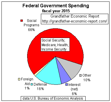
WHERE DOES THE MONEY GO ??
Following is a pie chart showing the
major spending components of a Federal Budget - and its huge red cloud
 The Government Spending Report and the
Government Growth Report show the federal government increased
its spending at a rate much faster than growth of the economy (nearly twice as fast) since
the end of World War II). Where does the spending go?
The Government Spending Report and the
Government Growth Report show the federal government increased
its spending at a rate much faster than growth of the economy (nearly twice as fast) since
the end of World War II). Where does the spending go?
Last fiscal year the federal government spent $3.7 Trillion - - or about $11,000 for each man, woman and child in America, up 81% since 2000..
The left chart displays this $3.7 Trillion as a pie, with each major spending component
shown as a percent of the total.
The BIGGIE is that HUGE
RED CLOUD in the chart called SOCIAL PROGRAM Spending, which consumes 66% of the budget. (To place this in
perspective, in 1948 social spending was but 10% of the federal budget - - prior to
the New Deal it was near zero).
This graphic is reviewed in more detail in the full Federal Spending Report - - next
link.
Additionally, also shown in the following link, the average federal government employee
earns over twice as much as the average private sector worker - - in addition to
significantly more job security.
You have just reviewed a summary report on Federal government spending.
Suggest you read the full Federal Government Spending Report
with easy to understand eye-opening pictures
E-mail the author
| Home & Contents
| Summary | Feedback | What's New | Link Index | Eye-opener | Must See |
This is the bottom of the Grandfather Federal Spending Report at https://grandfather-economic-report.com/fed_budget.htm
Copyright
© 1997-2016 Michael W. Hodges. The Grandfather Economic Report series is
the intellectual property of its author; all rights reserved under Copyright Conventions.
Permission to redistribute all or part of this series for non commercial purposes is
granted by the author, provided the associated web page address (URL) is included and full
credit given to the Grandfather Economic Report and the author, Michael Hodges. Notice
appreciated via email.