 U.S. Government Spending History - - a
soaring 140-year mega trend -
U.S. Government Spending History - - a
soaring 140-year mega trend - Grandfather Economic Report series
Home & Contents | Summary | Reader
Feedback | What's New | Eye-opener
| E-mail
International Government Growth |
(a chapter of the Grandfather Economic Report series with graphic presentation reviewing economic issues facing today's generation compared to prior periods, on: Family Income, debt, savings; government spending and size, education quality, social security, regulations, taxes, energy, inflation, foreign trade and exchange, voter turnout, trust, celebration, national security, and health care/life expectancy)
Quick-Links:
US Govt. spending history - - Govt.
spending history of 16 nations - - High Govt.Spending = Low
Economic Growth - -
Increasing Burden of Senior Citizens - - Gasoline Taxes by nation - - Bottom-Line
This mini-report is about soaring government-spending-dependence consumption of the USA compared to its own history and compared to that of other nations, in an easy-to-understand format with pictures. This is a chapter of the Grandfather Economic Report series of mini-picture reports showing serious economic trends facing families and their children, compared to prior generations.
QUESTIONS:
1. Do our children & grandchildren deserve to be placed in a more government-dominated
and dependent position than faced by prior generations - - just because many other nations
have taken this course?
2. When someone says the 'ERA OF BIG GOVERNMENT IS OVER', show them the following graphic and ask them 'When will the big government era be over?
(Note - - several data links are given below. To save time, it is suggested you skip them until you have read this full page).
U.S. Government Spending History - - a
soaring 140-year mega trend -
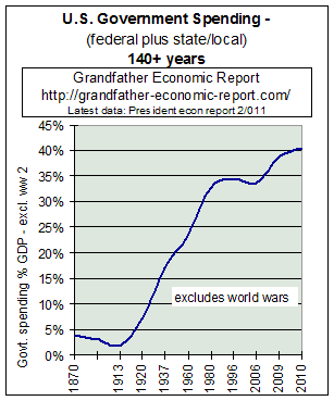
This chart shows the long-term mega trend (140 years) since 1870, of combined U.S. federal, state and local government peace-time spending, as a percentage of the size of the economy (measured by GDP). (Note - world war spending is excluded.)
NOTE - here are data points to be added to this chart beyond 2006 for US
government spending ratios:
2008 > 35.87%, 2009 > 38.84%, 2010 an all-time high > 40.47%.
This chart, as a ratio graphic, means that if government spending increased only at the same rate as the total economy grew then the curve on the chart would be a flat, horizontal line. Is it horizontal? Nope!!
And - if government was becoming more productive and less intrusive over time then the above curve would have a downward slope. Is the slope down? Nope!!
As shown, government spending soared upward at breath-taking growth rates - - soaring 10 times faster than the economy's growth since 1913, gathering upward steam with a massive build-up in social spending of the New Deal (1930s) and Great Society (1960s) programs - - programs which significantly impact us even more today.
Nice picture. Right?
Although the 'Reagan Era' of the 1980s stopped the wild, upward march of U.S. government spending ratios, the current level at the right edge of the chart is still 10 times higher than previously.
Please understand that this chart takes inflation into account - - since it's a ratio chart. In fact, it can be argued that the trend of this government growth chart is the cause of the declining internal buying power trend of the dollar over time shown in a similar, correlating chart in the Inflation Report.
Additionally, this government trend further enhances explosive debt growth in both the government and private sectors of the economy to all-time record highs, as documented in the chapter America's Total Debt Report and exploding International Trade Deficits. After all, government does not create private wealth. Government is non-productive and consumes wealth - - partly paid for by taxes, partly by debt, and partly by debasing its currency domestically and/or internationally.
Since the explosion of U.S. government spending has been driven by social spending programs, at growth rates many times faster than the general economy, such also potentially undermines capacity for security, as shown in the chapter National Security Report. In other words, a big government is not necessarily a stronger government in protecting its citizens from the designs of other nations. In fact, the greater percentage of its spending devoted to non-national security agendas the more diverted and less focused its capacity to protect itself.
How does the trend of this government spending chart compare with your understanding of our nation's founding forefather's commitment to small, limited government? (this commitment is covered in the Road Traveled Report.
The Government Spending Report shows other revealing graphics of U.S. government growth.
The next section will compare this U.S. government spending history with that of other nations. There you will note that the U.S. appeared to learn from Europe how to grow government, since the U.S. has spent as if it wanted to catch up - - maybe 'it's planners are jealous of nations with even larger government'.
U.S. vs. INTERNATIONAL GOVERNMENT
SPENDING
COMPARISONS WITH OTHER NATIONS - 126 year trends
If most economists today agree the private sector offers more
individual freedom, productivity and economic opportunity than the government sector, then
the citizens of the nation with the lower government-spending-dependence has a comparative
advantage. It will be shown by the following graphic that industrialized nations have
become 6-10 times more government-dependent than before - - but the US, which used to have
a huge advantage, and gave it up - - has the chance to significantly improve its advantage
- - provided it makes an organized effort to do so.
Following is a dramatic chart that shows the big picture - a mega-trend over the past 132 years of the explosive growth and dominance of government of all large industrial nations - - with government in the 16 nation average growing 5 times faster than the average economy of the 16 nations - - while U.S. government spending increased 10 times faster than the US economy.
Clearly, industrial world economies are significantly more government-spending-dependent than ever before in peace-time history.
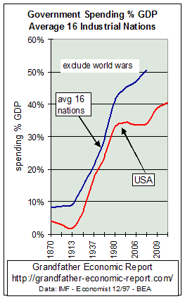 The left chart shows the soaring 140-year upward trend of combined
federal, state & local government peace-time spending, as a percentage of gross
domestic product. The upper black curve is the average of the 16 major industrial nations,
including the USA from 1870 to 2007. The red curve is the USA
only, up to today. (World War spending data is excluded.)
The left chart shows the soaring 140-year upward trend of combined
federal, state & local government peace-time spending, as a percentage of gross
domestic product. The upper black curve is the average of the 16 major industrial nations,
including the USA from 1870 to 2007. The red curve is the USA
only, up to today. (World War spending data is excluded.)
Remember. This is a ratio chart, of spending related to the size of the economy. If government spending had not grown faster than growth of the general economy, then both the black and the red lines would have been horizontal - - from left to right. But, are the curves horizontal? No!! - - both zoomed upward - - indicating government spending increased much faster than economic growth of the general economy.
LOOK at the left side of the chart, and compare to the right side. The black 16-nation average plot jumped from 8% of GDP to over 50% - - meaning government spending increased 6 times faster than general economic growth. The red plot for combined U.S. government (federal + state/local) spending increased from 3-4% of GDP to 40% - - 10 times faster than the economy.
Other OECD nations also increased the shares of their economies consumed by government
spending from 1995 to 2007 >
such as France from 51% to 61% of GDP; U.K. from 42% to a 50% ratio; Iceland from
34% to 58%; Portugal from 43% to 54%; Italy from 50% to 55%; Japan 27% to 31%; Austria 48%
to 54%. Other nations also increased but a bit slower: Ireland 40% to 42%; Switzerland 37%
to 38%; Germany 47% to 49%; Canada 46% to 48%; Netherlands 54% to 55%. Sweden reduced
spending from a huge 66% to a still large 58%.
Note the dramatic slowdown in the red curve trend line, starting with the 'Reagan Era' in the 1980s. Had the U.S. in 1993 implemented a proposed National Health Plan, its data point in 1996 would be near the same as the black curve for other nations. But, more recently this ratio is again accelerating upward.
The 43 years prior to 1913, the black curve of 16-nation government ratios was essentially flat, meaning government spending was not growing faster than the economies. During that period before 1913, USA spending ratios (red line) were not only declining but were one-third to one-half that of other nations. After World War I, the black curve started rising - - indicating an expansion of the average of all government spending faster than the growth of their economies, with the USA spending ratio starting its rise above 5% GDP in the 1930s, primarily driven by social thinking imported from Europe - called the 'New Deal' in the U.S. under President Roosevelt.
Looking to the rising part of both curves, it can be seen other industrial nations started their rise before the US, but then the US 'put on the steam' of government spending at an even faster rate - - as if the U.S. was trying to 'catch-up' with the spending ratios of others. From the 1960s onward, both curves show similar rates of government expansion at rates much faster than their economies - with U.S. ratios expanding faster.
Up until 1980, the 16-nation average maintained about 7% higher ratio of spending to GDP than the US, although both rose dramatically.
By 1980, the average of these nations had seen government spending ratios rise to 41% of GDP - - a 5 times higher share of the economy than was consumed on the left side of the chart. The USA curve by 1980 had reached 32.8% of GDP - - a 10 times higher share of its economy than before.
Something dramatic appeared in the 1980s. For the first time in 6 decades U.S. government spending (red curve) ratios ceased their massive rise at 33% of GDP, as the rate of government growth slowed dramatically and stopped rising. In the 1990s it again expanded faster than the economy, as it reached a 34.3% ratio by 1996 - despite rejection of the U.S. National Health Plan, despite economic growth relative to other nations, and despite the end of the Cold War. Such spending growth in the 1990s was partially 'hidden' to some observers by the fact U.S. defense spending ratios were driven down to near pre-Pearl Harbor levels - - unsustainable levels. Additionally, the 1990s witnessed the 2 largest tax increases in national history. But, this spending chart picks up what counts - - the spending.
Regarding the black curve for the average of 16 nations after 1980, said growth rate continued to skyrocket much faster than in the US - - reaching 45% of GDP by 1996, about 6 times higher than at its bottom - - and 11 points higher than the US by 1996.
Let's restate: all major industrialized national world economies are significantly (5-10 times) more government-spending-dependent than ever before in their peace-time history - - and that increase is almost entirely social entitlement spending.
What is being done to stop and reverse this run-away government growth & dominance?
Clearly such trends lead to vast changes in society with each rise - - especially since the spending growth of all such nations is in consumptive social categories - - completely consumed and not available to benefit future generations. Additionally and despite such massive government growth, social institutions are not becoming better and more representative and solvent - - they are becoming less sustainable and less solvent, such as the social security and Medicare-health systems in all industrialized nations - - with long periods of stagnant real family incomes and less equity and equivalency available for future generations - - as benefits for our young, when they retire, are projected to be far less than that for prior generations.
We often hear pro-big-government U.S. politicians and bureaucrats claim that government spending and taxation could be more in the U.S. since that is the case in other nations. Nobel laureate Dr. Milton Friedman has written this author on that point - - saying, "the fact other governments choose to be more big-government oriented is not an excuse for the U.S. to follow."
Regarding taxation - the average person in the U.S. now works 5.3 months per year to support government spending at all levels, compared to just 1.4 months per year when I was a youngster. This equates to the above government spending trend chart - - government must be paid for and more government equals more paying - - reducing individual freedom and economic security. See the Tax Report chapter for dramatic graphics.
It is the contention of this author that the freedom of individuals, and of their economic opportunity and security, is reduced in proportion to the rise in government-spending dependence of their nation. Further, as spending ratios rise there comes into play increased impact of a multiplier effect whereby eventually government is in control of larger and larger segments of society - - first by virtue of national income transfers from the private sector to the government sector, then by the accelerating costs of regulatory compliance mandates on the diminished private sector. The ultimate, of course, points toward government complete control, as in Germany in the 1930s. It is possible that Europe today is close to that danger point as they added in Brussels another government bureaucracy (the EU) of spending and regulations on top of already high amounts of same in the individual nation states. Extended further, not only is world war more likely, but the eventual collapse of entire economies as in Russia.
"True, many governments recently have tried to cut budget defects and debt of late. By and large, however, they have succeeded only in slowing, not reversing, the rate of spending growth - - while actually increasing regulatory control of the private sector with its added compliance costs. Where budget deficits have been reduced, this has been done by raising taxes instead of by reducing total expenditures. The spending ratios in the advanced economies is bigger than in 1990. Even in Britain, after 20 years of strenuous efforts to roll back the state, ratios are about the same as in 1980," The Economist, 12/6/97, page 88.
In the US, state & local government ratios continue to expand faster than the economy - reaching a new high each year, including the most recent year - - because the headcount of their employees continued to expand in numbers faster than growth of the total population. While many citizens have heard that each worker must today support more retirees on social security than ever before, few recognize each worker today must also support more state & local government employees than ever before. See the State & Local Government Spending report for some dramatic trend graphics for this sector of the U.S. economy.
High Government Spending Ratios Reduce Economic Growth and Investment |
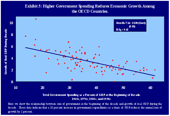 The left chart is from a Congressional study of all
OECD nations (incl. USA). The left chart is from a Congressional study of all
OECD nations (incl. USA).The study was called 'The Size and Functions of Government And Economic Growth', Joint Economic Congressional Committee, Jim Saxton, chairman, April 1998. It shows the relationship between government size (spending percent GDP) and economic growth. It proves, via the downward sloping dark line, that the larger government size (the X-axis) the smaller economic growth (the Y-axis). Additional data in this study was of the high-growth, small government nations, such as South Korea. All studies showed government spending at approx. 20% GDP desirable for economic growth. This finding should not be surprising, since few economists would agree that the government sector is the prime driver of economic growth over the long term. Therefore, the higher the government spending share of the economy the lower its economic growth. This 1998 study is at: http://www.house.gov/jec/growth/function/function.htm |
This leads us to our next graphic - -
the burden on working people supporting seniors,
looking forward.
FUTURE BURDEN OF AGING POPULATION -
Which nation will properly act first?
 Looking forward, one of the main items that will
impact national economics of many nations will be the exploding population of senior
citizens - and how each nation responds to the challenge.
Looking forward, one of the main items that will
impact national economics of many nations will be the exploding population of senior
citizens - and how each nation responds to the challenge.
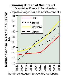
The left chart shows the course expected of four major trading nations - - being the growth in the number of citizens over age 65 per 100 citizens aged 15-64.
The red solid line is the U.S., growing from about 18 seniors per 100 age 15-64 to 36 per 100 - - a doubling.
As seen from the chart data for Britain, Germany and Japan - - these nations face similar challenges - - and, Germany & Japan face major challenges.
Clearly, the extreme growth rates of total government spending % GDP to date in all these nations (included in the first chart above) have been mostly driven by social spending - - much being on seniors. Slower birth rates coupled with increased longevity have place the senior pension programs and the entire government at risk. The chart at the left raises the point that governments can no longer put off and simply tinker with the burden of aging populations - - and it is possible the first of these nations to privatize senior care will be potentially more economically viable than those that drag their feet.
Note the red line for the USA. It lags the ratios and growth of the other nations - - clearly an advantage to the US economy at least until 2010 - - not of its own doing but by virtue of simple demographics to date. This lag until now is also reflected in the US advantage to date in the chart at the top of this report for total spending ratios. acknowledgment: thanks to The Economist of 4/11/98 for publishing the data used in the above chart.
Other reports involving seniors - A long-term trend chart of U.S. life expectancy is in the Celebration Report chapter. A complete discussion of social security trends, with many long-term pictures including one of the U.S. 'Time Bomb of Demographics', is in the Social Security Report chapter. And, this past siphoning-off of trust fund surpluses is in the Trust Fund Report.
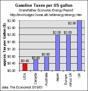
One last chart.
Showing comparative gasoline taxes in various nations.
As of 2001. Data source on chart.
Note European taxation is 5 times the USA rate.
That said it must also me pointed out that government as a share of the economy is also higher in Europe than the USA.
And, Europe and Japan have no oil reserves of their own - - therefore their import ratios are also higher than the USA.
See Grandfather Energy Report for spending ratios and trends.
Believing the less government dominance the better for future individual freedom, living standards and national security, the above charts indicate:
The battle lines may be between those pushing for a 'world government', where the bureaucracies of international institutions control more and more of the world's economies and their citizens at the expense of national sovereignties, Vs. those nations successfully resisting said influence by downsizing government spending and regulatory compliance cost ratios, and reducing the nation's dependence on government and private sector debt - while maintaining proper levels of national defense.
CLICK THIS LINK TO THE
Companion report on US Govt. Growth,
with color pictures you have never seen
or- return to the home page of other trends
| Home & Contents | Summary | Feedback | What's New | Link Index | Eye-opener | Must See |
Copyright © 1997-2011 Michael W. Hodges.
The Grandfather Economic Report series is the intellectual property of its author; all rights reserved under Copyright Conventions. Permission to redistribute all or part of this series for non commercial purposes is granted by the author, provided the associated web page address (URL) is included and full credit given to the Grandfather Economic Report and the author, Michael Hodges, with notice via email.bottom of page at https://grandfather-economic-report.com/intl-spend.htm